Python Camp
Life is short. You need Python.
시각화 패키지 Matplotlib 소개
MATLAB에서 영감을 얻은 Python 플로팅 라이브러리이다. 사용되는 용어(Axis, Figure, Plots)는 MATLAB에서 사용되는 용어와 유사하다.
Matplotlib는 파이썬에서 자료를 차트(chart)나 플롯(plot)으로 시각화(visualization)하는 패키지이다.
Matplotlib는 다음과 같은 정형화된 차트나 플롯 이외에도 저수준 api를 사용한 다양한 시각화 기능을 제공한다.
- 라인 플롯(line plot)
- 스캐터 플롯(scatter plot)
- 컨투어 플롯(contour plot)
- 서피스 플롯(surface plot)
- 바 차트(bar chart)
- 히스토그램(histogram)
- 박스 플롯(box plot)
Matplotlib를 사용한 시각화 예제들을 보고 싶다면 Matplotlib 갤러기 웹사이트를 방문한다.
- http://matplotlib.org/gallery.html
1. Pyplot
Pyplot은 MATLAB에 익숙한 사람들이 쉽게 사용할 수 있도록 Matplotlib에 대한 ‘쉘형’ 인터페이스이다.
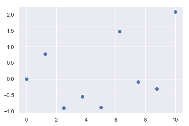
import matplotlib.pyplot as plt
import numpy as np
x = np.linspace(0, 10, 9) #0부터 10사이를 9등분으로 쪼갠 리스트 생성
y = np.random.randn(9) #평균값이 0, 표준편차가 1인 가우시안 표준정규분포를 따르는 1*9 크기의 난수를 발생함
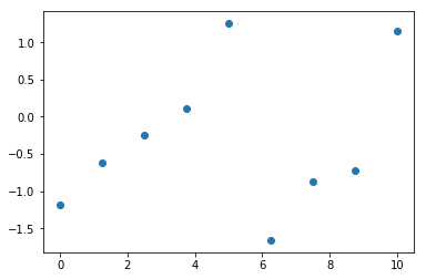
plt.scatter(x, y)
plt.show()
import matplotlib.pyplot as plt
import numpy as np

x = np.linspace(0, 10, 9) #0부터 10사이를 9등분으로 쪼갠 리스트 생성
y = np.random.randn(9) #평균값이 0, 표준편차가 1인 가우시안 표준정규분포를 따르는 1*9 크기의 난수를 발생함

plt.scatter(x, y)
<matplotlib.collections.PathCollection at 0x22bf5a72160>
2. Pylab
Pyplot과 Numpy를 하나로 결합하는 아이디어이다.
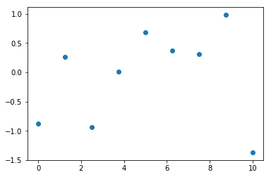
from matplotlib.pylab import *

x = linspace(0, 10, 9)
y = randn(9)

scatter(x, y)
show()
3. 라인 플롯
가장 간단한 플롯은 선을 그리는 라인 플롯(line plot)이다. 라인 플롯은 데이터가 시간, 순서 등에 따라 어떻게 변화하는지 보여주기 위해 사용한다.
명령은 pyplot 서브패키지의 plot 명령을 사용한다.
- http://Matplotlib.org/api/pyplot_api.html#Matplotlib.pyplot.plot
데이터가 1, 4, 9, 16 으로 변화하였다면 다음과 같이 plot 명령에 데이터 리스트 혹은 ndarray 객체를 넘긴다.
plt.title("Plot")
plt.plot([1, 4, 9, 16])
plt.show()
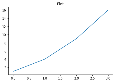
이 때 x 축의 자료 위치 즉, 틱(tick)은 자동으로 0, 1, 2, 3이 된다.
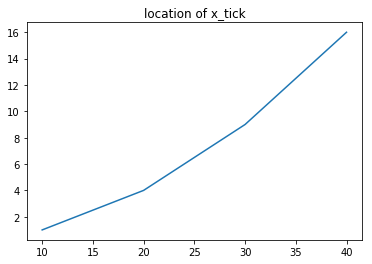
만약 이 x_tick 위치를 별도로 명시하고 싶다면 다음과 같이 두개의 같은 길이의 리스트 혹은 배열 자료를 넣으면 된다.
plt.title("location of x_tick")
plt.plot([10, 20, 30, 40], [1, 4, 9, 16])
plt.show()
show 명령은 시각화 명령을 실제로 차트로 렌더링(rendering)하고 마우스 움직임 등의 이벤트를 기다리라는 지시이다.
주피터 노트북에서는 셀 단위로 플롯 명령은 자동 렌더링 해주므로 show 명령이 필요없지만 일반 파이썬 인터프리터로 가동되는 경우를 대비하여 항상 마지막에 실행한다.
show 명령을 주면 마지막 플롯 명령으로부터 반환된 플롯 객체의 표현도 가려주는 효과가 있다.
3-1. 스타일 지정
플롯 명령어는 보는 사람이 그림을 더 알아보기 쉽게 하기 위해 다양한 스타일(style)을 지원한다.
plot 명령어에서는 다음과 같이 추가 문자열 인수를 사용하여 스타일을 지원한다.
plt.title("'rs--' style plot ")
plt.plot([10, 20, 30, 40], [1, 4, 9, 16], 'rs--')
plt.show()
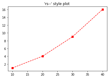
스타일 문자열은 색깔(color), 마커(marker), 선 종류(line style)의 순서로 지정한다. 만약 이 중 일부가 생략되면 디폴트값이 적용된다.
3-1-1. 색깔
색깔을 지정하는 방법은 색 이름 혹은 약자를 사용하거나 # 문자로 시작되는 RGB 코드를 사용한다.
자주 사용되는 생깔은 한글자 약자를 사용할 수 있으며 약자는 아래 표에 정리하였다. 전체 색깔 목록은 다음 웹사이트를 참조한다.
- http://Matplotlib.org/examples/color/named_colors.html

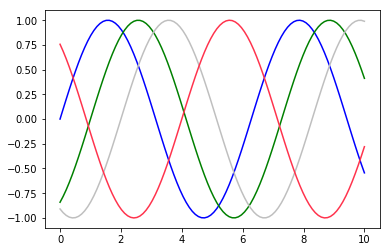
#플롯 수정하기: 선 색상과 스타일
x = np.linspace(0, 10, 100)

plt.plot(x, np.sin(x - 0), color='blue')           # 색상을 이름으로 지정
plt.plot(x, np.sin(x - 1), color='g')              # 짧은 색상 코드(rgbcmyk)
plt.plot(x, np.sin(x - 2), color='0.75')           # 0과 1 사이로 회색조 지정
plt.plot(x, np.sin(x - 4), color=(1.0, 0.2, 0.3))  # RGB 튜플, 0과 1 값
plt.show()
3-1-2. 마커
데이터 위치를 나타내는 기호를 마커(marker)라고 한다. 마커의 종류는 다음과 같다.

3-1-3. 선 스타일
선 스타일에는 실선(solid), 대시선(dashed), 점선(dotted), 대시-점선(dash-dot) 이 있다. 지정 문자열은 다음과 같다.

3-1-4. 기타 스타일
라인 플롯에서는 앞서 설명한 세 가지 스타일 이외에도 여러가지 스타일을 지정할 수 있지만 이 경우에는 인수 이름을 정확하게 지정해야 한다. 사용할 수 있는 스타일 인수의 목록은 Matplotlib.lines.Line2D 클래스에 대한 다음 웹사이트를 참조한다.
- http://Matplotlib.org/api/lines_api.html#Matplotlib.lines.Line2D
라인 플롯에서 자주 사용되는 기타 스타일은 다음과 같다.

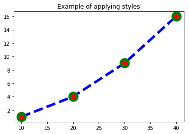
plt.plot([10, 20, 30, 40], [1, 4, 9, 16], c="b",
         lw=5, ls="--", marker="o", ms=15, mec="g", mew=5, mfc="r")
plt.title("Example of applying styles")
plt.show()
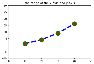
3-2. 그림 범위 지정
플롯 그림을 보면 몇몇 점들은 그림의 범위 경계선에 있어서 잘 보이지 않는 경우가 있을 수 있다.
그림의 범위를 수동으로 지정하려면 xlim 명령과 ylim 명령을 사용한다.
이 명령들은 그림의 범위가 되는 x축, y축의 최소값과 최대값을 지정한다.
plt.title("the range of the x-axis and y-axis")
plt.plot([10, 20, 30, 40], [1, 4, 9, 16],
         c="b", lw=5, ls="--", marker="o", ms=15, mec="g", mew=5, mfc="r")
plt.xlim(0, 50)
plt.ylim(-10, 30)
plt.show()
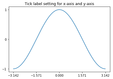
3-3. 틱 설정
플롯이나 차트에서 축 상의 위치 표시 지점을 틱(tick)이라고 하고 이 틱에 써진 숫자 혹은 글자를 틱 라벨(tick label)이라고 한다.
틱의 위치나 틱 라벨은 Matplotlib가 자동으로 설정해주지만 만약 수동으로 설정하고 싶다면 xticks, yticks 명령을 사용한다.
X = np.linspace(-np.pi, np.pi, 256)
C = np.cos(X)
plt.title("Tick label setting for x-axis and y-axis")
plt.plot(X, C)
plt.xticks([-np.pi, -np.pi / 2, 0, np.pi / 2, np.pi])
plt.yticks([-1, 0, +1])
plt.show()
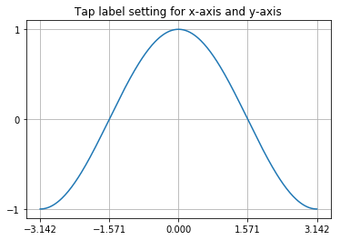
3-4. 그리드 설정
틱 위치를 잘 보여주기 위해 그리드 선(grid line)을 생성할 수 도 있다.
그리드를 사용하려면 grid(True) 를 사용하고, 다시 그리드를 사용하지 않으려면 grid(False) 명령을 사용한다.
X = np.linspace(-np.pi, np.pi, 256)
C = np.cos(X)
plt.title("Tap label setting for x-axis and y-axis")
plt.plot(X, C)
plt.xticks([-np.pi, -np.pi / 2, 0, np.pi / 2, np.pi])
plt.yticks([-1, 0, +1])
plt.grid(True)
plt.show()
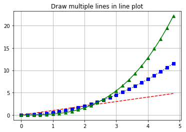
3-5. 여러개의 선 그리기
라인 플롯에서 여러개의 선을 그리고 싶은 경우에는 x 데이터, y 데이터, 스타일 문자열을 반복하여 인수로 넘긴다.
이 경우에는 하나의 선을 그릴 때처럼 x 데이터나 스타일 문자열을 생략할 수 없다.
t = np.arange(0., 5., 0.2)
plt.title("Draw multiple lines in line plot")
plt.plot(t, t, 'r--', t, 0.5 * t**2, 'bs:', t, 0.2 * t**3, 'g^-')
plt.grid(True)
plt.show()
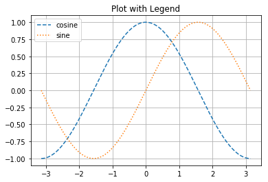
3-6. 범례
여러개의 라인 플롯을 동시에 그리는 경우에는 각 선이 무슨 자료를 표시하는지를 보여주기 위해 legend 명령으로 범례(legend)를 추가할 수 있다.
범례의 위치는 자동으로 정해지지만 수동으로 설정하고 싶으면 loc 인수를 사용한다.
인수에는 문자열 혹은 숫자가 들어가며 가능한 코드는 다음과 같다.

X = np.linspace(-np.pi, np.pi, 256)
C, S = np.cos(X), np.sin(X)
plt.title("Plot with Legend")
plt.plot(X, C, ls="--", label="cosine")
plt.plot(X, S, ls=":", label="sine")
plt.legend(loc=2)
plt.grid(True)
plt.show()
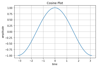
3-7. x축, y축 라벨, 타이틀
플롯의 x축 위치와 y축 위치에는 각각 그 데이터가 의미하는 바를 표시하기 위해 라벨(label)를 추가할 수 있다. 라벨을 붙이려면 xlabel. ylabel 명령을 사용한다.
또 플롯의 위에는 title 명령으로 제목(title)을 붙일 수 있다.
X = np.linspace(-np.pi, np.pi, 256)
C, S = np.cos(X), np.sin(X)
plt.plot(X, C, label="cosine")
plt.xlabel("time")
plt.ylabel("amplitude")
plt.title("Cosine Plot")
plt.grid(True)
plt.show()
3-8. 홀드 명령
하나의 plot 명령이 아니라 복수의 plot 명령을 하나의 그림에 겹쳐서 그릴 수도 있다.
Matplotlib 1.5까지는 hold(True) 명령을 이용하여 기존의 그림 위에 겹쳐 그리도록 하였다. 겹치기를 종료하는 것은 hold(False) 명령이다.
Matplotlib 2.0부터는 모든 플롯 명령에 hold(True)가 자동 적용된다.
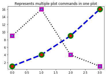
plt.title("Represents multiple plot commands in one plot")
plt.plot([1, 4, 9, 16],
         c="b", lw=5, ls="--", marker="o", ms=15, mec="g", mew=5, mfc="r")
# plt.hold(True)   # <- 1,5 버전에서는 이 코드가 필요하다.
plt.plot([9, 16, 4, 1],
         c="k", lw=3, ls=":", marker="s", ms=10, mec="m", mew=5, mfc="c")
# plt.hold(False)  # <- 1,5 버전에서는 이 코드가 필요하다.
plt.show()
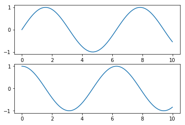
3-9. subplot 설정
#매트랩 스타일의 인터페이스
# 두개의 패널 중 첫번째 패널을 생성하고 현재 축(axis)을 설정
plt.subplot(2, 1, 1) # (rows, columns, panel number)
plt.plot(x, np.sin(x))

plt.subplot(2, 1, 2)
plt.plot(x, np.cos(x))

plt.show()
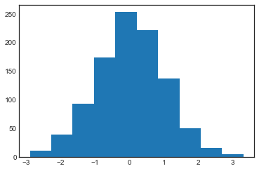
4. 히스토그램
import numpy as np
import matplotlib.pyplot as plt
plt.style.use('seaborn-white')

data = np.random.randn(1000)
plt.hist(data)
(array([ 11.,  39.,  93., 174., 253., 221., 137.,  51.,  16.,   5.]),
 array([-2.88234171, -2.2631336 , -1.64392549, -1.02471738, -0.40550927,
         0.21369884,  0.83290695,  1.45211506,  2.07132317,  2.69053128,
         3.30973939]),
 <a list of 10 Patch objects>)

plt.hist(data);
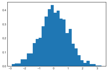
plt.hist(data, bins=30, density=True);
연습문제 1 !
여러가지 함수를 사용하여 아래 조건에 맞는 그래프를 그린다.
- xlabel, ylabel, title을 모두 갖추고 있어야 한다.
- 하나의 Figure(일단, 그림이라고 이해한다.)에 2개 이상의 Plot을 그린다.
- 각 Plot은 다른 선, 마크, 색 스타일을 가진다.
- legend는 그래프와 겹치지 않는 곳에 위치 시키도록 한다.
Seaborn을 활용한 데이터 분포 시각화
1. Seaborn과 Matplotlib의 차이
# Seaborn과 Matplotlib의 차이
import matplotlib.pyplot as plt
import numpy as np
import pandas as pd
rng = np.random.RandomState(0)
x = np.linspace(0, 10, 500)
y = np.cumsum(rng.randn(500, 6), 0)
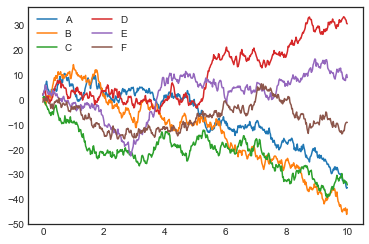
plt.plot(x, y)
plt.legend('ABCDEF', ncol=2, loc='upper left')
plt.show()
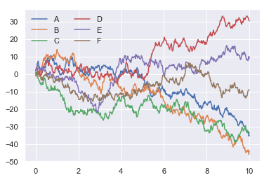
import seaborn as sns
sns.set()
plt.plot(x, y)
plt.legend('ABCDEF', ncol=2, loc='upper left')
plt.show()
2. 1차원 분포 플롯
1차원 데이터는 실수 값이면 히스토그램과 같은 실수 분포 플롯으로 나타내고 카테고리 값이면 카운트 플롯으로 나타낸다.
우선 연습을 위한 샘플 데이터를 로드한다.
iris = sns.load_dataset("iris") #붓꽃 데이터
titanic = sns.load_dataset("titanic") #타이타닉호 데이터
tips = sns.load_dataset("tips") #팁 데이터
flights = sns.load_dataset("flights") #여객운송 데이터
2-1. 1차원 실수 분포 플롯
실수 분포 플롯은 자료의 분포를 묘사하기 위한 것으로 Matplotlib의 단순한 히스토그램고 달리 커널 밀도(kernal density) 및 러그(rug) 표시 기능 및 다차원 복합 분포 기능 등을 제공한다.
1차원 실수 분포 플롯 명령에는 rugplot, kdeplot, distplot 이 있다.
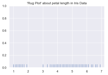
- 러그(rug) 플롯은 데이터 위치를 x축 위에 작은 선분(rug)으로 나타내어 실제 데이터들의 위치를 보여준다.
- rugplot : http://seaborn.pydata.org/generated/seaborn.rugplot.html
x = iris.petal_length.values
x
array([1.4, 1.4, 1.3, 1.5, 1.4, 1.7, 1.4, 1.5, 1.4, 1.5, 1.5, 1.6, 1.4,
       1.1, 1.2, 1.5, 1.3, 1.4, 1.7, 1.5, 1.7, 1.5, 1. , 1.7, 1.9, 1.6,
       1.6, 1.5, 1.4, 1.6, 1.6, 1.5, 1.5, 1.4, 1.5, 1.2, 1.3, 1.4, 1.3,
       1.5, 1.3, 1.3, 1.3, 1.6, 1.9, 1.4, 1.6, 1.4, 1.5, 1.4, 4.7, 4.5,
       4.9, 4. , 4.6, 4.5, 4.7, 3.3, 4.6, 3.9, 3.5, 4.2, 4. , 4.7, 3.6,
       4.4, 4.5, 4.1, 4.5, 3.9, 4.8, 4. , 4.9, 4.7, 4.3, 4.4, 4.8, 5. ,
       4.5, 3.5, 3.8, 3.7, 3.9, 5.1, 4.5, 4.5, 4.7, 4.4, 4.1, 4. , 4.4,
       4.6, 4. , 3.3, 4.2, 4.2, 4.2, 4.3, 3. , 4.1, 6. , 5.1, 5.9, 5.6,
       5.8, 6.6, 4.5, 6.3, 5.8, 6.1, 5.1, 5.3, 5.5, 5. , 5.1, 5.3, 5.5,
       6.7, 6.9, 5. , 5.7, 4.9, 6.7, 4.9, 5.7, 6. , 4.8, 4.9, 5.6, 5.8,
       6.1, 6.4, 5.6, 5.1, 5.6, 6.1, 5.6, 5.5, 4.8, 5.4, 5.6, 5.1, 5.1,
       5.9, 5.7, 5.2, 5. , 5.2, 5.4, 5.1])
sns.rugplot(x)
plt.title("'Rug Plot' about petal length in Iris Data")
plt.show()
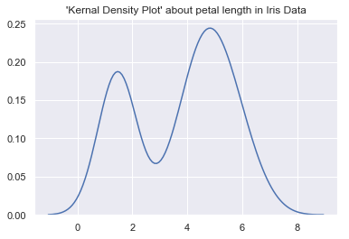
- 커널 밀도(kernal density)는 커널이라는 함수를 겹치는 방법으로 히스토그램보다 부드러운 형태의 분포 곡선을 보여주는 방법이다.
- kdeplot : http://seaborn.pydata.org/generated/seaborn.kdeplot.html
sns.kdeplot(x)
plt.title("'Kernal Density Plot' about petal length in Iris Data")
plt.show()
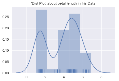
- distplot 명령은 러그와 커널 밀도 표시 기능이 있어서 Matplotlib의 hist 명령보다 많이 사용된다.
- distplot : http://seaborn.pydata.org/generated/seaborn.distplot.html
sns.distplot(x, kde=True, rug=True)
plt.title("'Dist Plot' about petal length in Iris Data")
plt.show()
2-2. 카운트 플롯
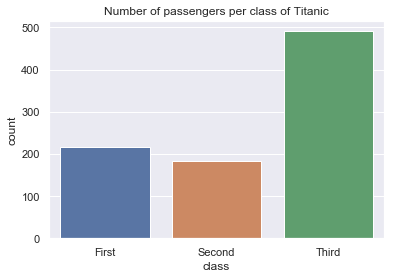
- countplot 명령을 사용하면 각 카테고리 값별로 데이터가 얼마나 있는지 표시할 수 있다.
- countplot : http://seaborn.pydata.org/generated/seaborn.countplot.html
- countplot 명령은 데이터프레임에만 사용할 수 있다. 사용 방법은 다음과 같다.
countplot(x=”class_name”, data=dataframe)
- x 인수에는 데이터프레임의 열 이름 문자열을, data 인수에는 대상이 되는 데이터프레임을 넣는다.
sns.countplot(x="class", data=titanic)
plt.title("Number of passengers per class of Titanic")
plt.show()
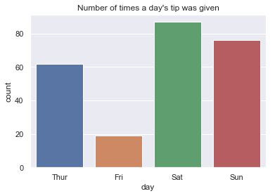
sns.countplot(x="day", data=tips)
plt.title("Number of times a day's tip was given")
plt.show()